
Sierra Club BC
The nature of growth: A brighter identity and mission for environmental wellbeing.
What we did
Systems Change Consulting, Strategic Planning, Brand Strategy, Identity System, Messaging

Creating a brighter future with the Sierra Club BC.
As BC's oldest environmental organization, Sierra Club BC stood at a crossroads, eager to redefine its brand to mirror its growth, vision, and new direction. The challenge was to evolve beyond the conventional 'us vs. them' environmental crisis narrative. The brand needed to reflect their commitment to intersectionality, strengths-based approaches, innovative partnerships, and community collaboration, all while effectively championing impactful environmental stewardship.
In close collaboration with Sierra Club BC's entire team, supporters, donors, and Indigenous leaders, Wiseblood crafted a culturally sensitive and respectful brand discovery process. We prioritized creating safe spaces for open dialogue, actively listening and learning to navigate complex concepts. This approach enabled us to develop a brand language that authentically reflects SCBC's aspirations for positive change. Our joint efforts culminated in a brand narrative and visual identity that aligns with SCBC’s progressive vision and honours the diverse voices contributing to their transformative journey.
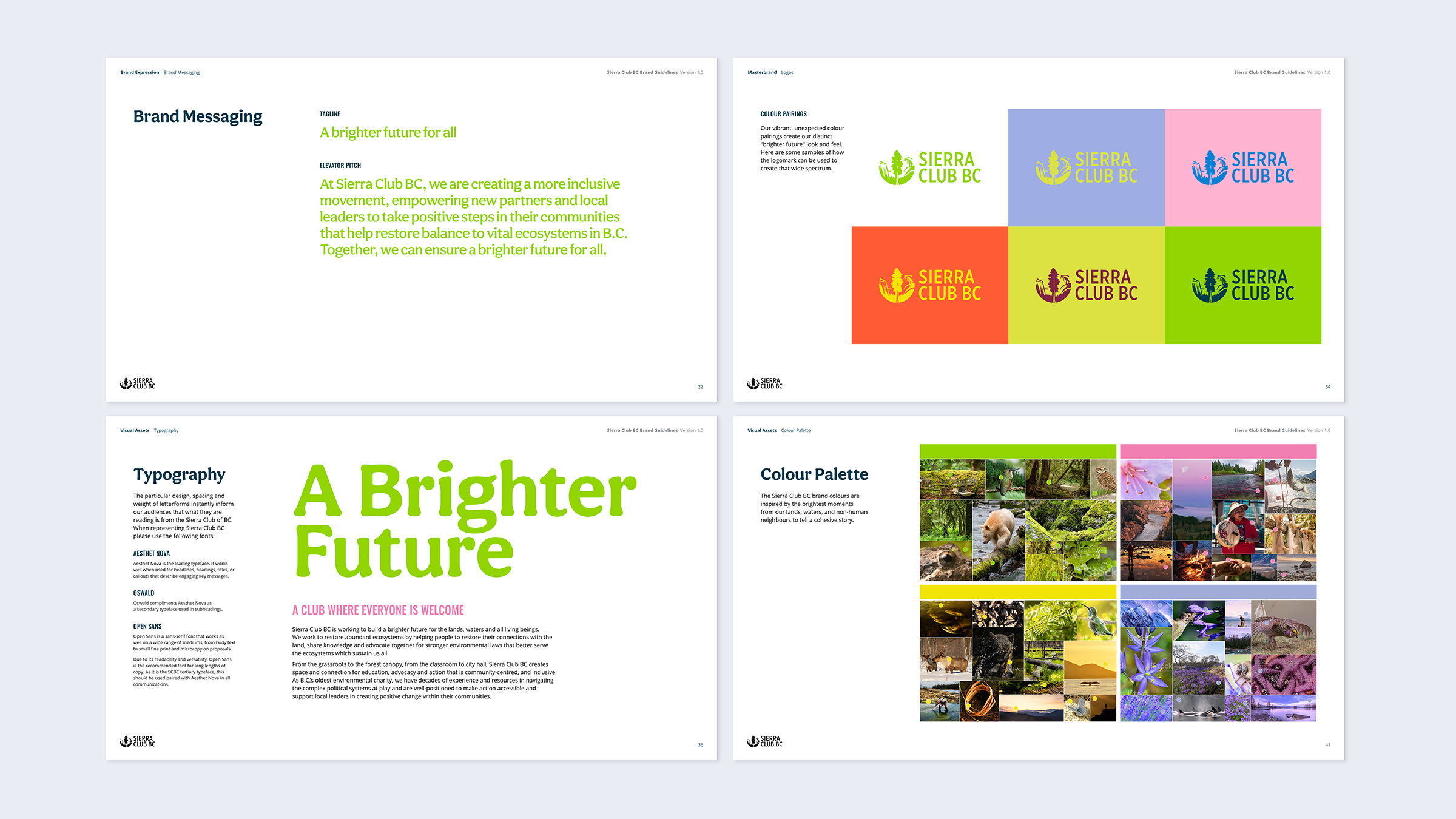

Brand Style Guide
To bridge the gap between Sierra Club BC's legacy and its progressive future, Wiseblood developed a vibrant brand and visual system designed to radiate the optimism of the "brighter future" the organization seeks to build. Recognizing the need for a distinct regional identity, we intentionally sought to create a clear visual separation from the parent Sierra Club brand in America, ensuring the BC chapter’s unique commitment to intersectionality and Indigenous partnerships stood front and center. Moving away from traditional crisis-driven aesthetics, we engineered a visual identity rooted in community collaboration and strengths-based narratives, ensuring the new look felt as dynamic and inclusive as their evolving mission. This creative transformation culminated in a comprehensive style guide and strategic toolkit that empowers the internal team to independently produce cohesive, professional assets that honor their transformative journey and champion impactful stewardship across every channel.


Print Templates
To ground this "brighter future" vision in day-to-day operations, Wiseblood built a suite of practical, high-impact templates for Cases for Support and investor presentations. We moved decisively away from the American parent brand's shadow, replacing standard environmental tropes with a distinct visual language that highlights regional Indigenous partnerships and community action. These templates serve as functional tools that translate complex data into clear, persuasive stories for donors and stakeholders. By delivering these ready-to-use assets, we empowered the internal team to produce professional, consistent materials that carry the same transformative energy as the new Sierra Club BC brand.

Large Print Templates
To take this vision into the public eye, Wiseblood designed vibrant, large-scale templates for out-of-home posters, billboards, and events as the brand's boldest expression. These assets translate the organization's new identity into high-contrast, optimistic designs built to grab attention in the physical world. These templates provide the team with the tools to turn any public space into a platform for Sierra Club BC’s message, ensuring their vision for a "brighter future" is unmistakable and impossible to miss.